

Alexandra Navratil’s film and slide installations suggest an almost Warburgian drive to amass visual records of historical and political processes. She organises these collections not via iconography, but in accordance with self-fashioned typologies that question the economic, social and political implications of image production. In this discussion, Jennifer Burris and Navratil talk about the methodologies, influences and thinking behind the works Views (This Formless Thing) (2013), Modern Magic (2013) and Untitled (Animation) (2013). Taking the early years of the chemical industry as starting point, these three works divulge the interdependent histories of plastics, applied colour in film, colonial exchange and the magical fetishism of commodity production.
Jennifer Burris: Perhaps we can begin with your impulse to collect images: where do you think this drive comes from?
Alexandra Navratil: It often starts with discovering hidden or overlooked similarities or properties in found material. With Modern Magic [2013, 2 slide projectors, faders, 162 slides, loop] for example, I was looking through a magazine called Modern Plastics for sentence fragments about the transformation of synthetic material, hoping to find something that described the magic of it, and I couldn’t find anything that convincing. But then I started noticing these images of hands manipulating and presenting new synthetic materials — disembodied against dark backgrounds, illuminated with a bright halo-like light… Intrigued, I searched for these types of images in every past edition, published from 1934 to 2004. You’re looking for something, and all of a sudden something else catches your attention: a moment in the process that somehow escapes control and becomes about intuition. But then, of course, a system arises because you want to have the complete collection, because what is a collection if it is not complete?
JB: What are your means of access to images?
AN: The full edition of Modern Plastics is stored in the technical library archives of Delft University of Technology, so I was able to scan the images directly. When working with nitrate film it is very different: in the Netherlands original nitrate film rolls are stored in World War II bunkers and so as an outsider you can only access safety film copies, VHS versions, or digital scans.
JB: What a strange thought – nitrate – an inherently unstable substance yet intended to preserve an image…
AN: The nitrate films are constantly deteriorating. Even if it is scanned, you only have momentary stability: just a snapshot in time. There is an ongoing discussion of how such things should be preserved. Should they be restored to their ‘original’ state? Should the traces of decay be included? Decisions in preservation and restoration are largely a question of historical taste. That is why, even after some restorations, an image of the way the material was found is often kept because of the possibility that someone will eventually restore the sample again, but in a different way.

JB: Indeterminacy or differentiation: much of your work seems to be about these key themes. Does this interest in restoration also suggest nostalgia?
AN: I don’t think so, especially since a lot of my research in archives is only possible because so much is digitised. Otherwise you just cannot access it.
JB: Why then transfer digital files to 16mm film format, or to carousel slides? Why this return to antiquated technology?
AN: In the case of Sample Frames [2011–2012, 4 synchronised slide projectors, 324 slides, loop] the images I was working with were originally nitrate slides and I felt they needed to be brought back to a certain tangibility. Likewise, when making Views (This Formless Thing) [2013, 16mm film, 9min 33sec, colour, silent, loop] it was important to install it so you can see the filmstrip move through the film projector: in that way, the work has a greater physical presence. I don’t think of it as a nostalgic decision. It’s a decision about materiality and immateriality in relation to different technologies of image reproduction.
JB: As with Sample Frames you showed Modern Magic on multiple slide projectors…
AN: Yes, and they’re arranged in two groups, but they are not synchronised or intended to be displayed next to each other in a space. One group shows hands pulling and bending plastic material. In the other group the hands are displaying the plastic objects.
JB: Like a nineteenth-century magic show?
AN: Yes, and by a ‘sleight of hand’ things appear and disappear, or change into other things.

JB: This desire to pinpoint seemingly abstract properties and make operative functions visible seems to be at the core of your work. Rather than focus on a cultural history of objects, you materialise cultural histories of processes or illusions. For example in Views (This Formless Thing), through re-combining found fragments of early 20th century applied colour in film, you explore the phenomenon known as ‘fringing’. How did you come across this, and what meaning do you ascribe to this unintentional disembodied colour?
AN: I had been thinking about early colour processes, such as tinting and toning, and how these methods were embedded in design and fashion. ‘Fringing’ describes an error – when the applied colour disassociates from the object and floats through the film, becoming an ‘object’ in itself. The result is a visual disparity between the objects and their colours. In What Color Is the Sacred?, Michael Taussig calls colour a ‘polymorphous magical substance’ capable of affecting all senses, expanding Walter Benjamin’s notion that with colour (and the movies) one’s eye is encouraged to enter the image, to suggest that one’s whole body is pulled in.01 Beyond the attraction of an obsolete and sensuous technique, I was drawn to this idea that synthetic process might have ‘magical’ properties. Bodies and objects vibrate and imply movement despite the static camera shots; colour becomes independent and tangible.
JB: In the film, this manifestation of colour as an object apart, rather than intrinsic to the world, is emphasised by the manner in which commodity items – pieces of clothing, props, bags, shoes, scarves and headpieces – are all hued, while landscapes, skies, and buildings are left in black-and-white. Is there something about colour in itself that makes it desirable or luxurious?
The transition from natural to synthetic dyes had economic, ideological, and geopolitical implications.
AN: Early film colour should be considered within the wider context of changes in colour technologies in design, fashion and printing: the transition from natural to synthetic dyes had economic, ideological and geopolitical implications. Stencil colouring was often applied to the kind of non-fiction films historian Tom Gunning calls ‘views’ – where a sequence of static camera shots showed an ‘exotic’ location or person.020304Film colour in the West was thus always associated with the body of the ‘other’: the woman, the child or the ‘foreigner’. This Formless Thing is all about these bodies; the anthropometric manner in which bodies are depicted and scrutinised, returned or refused glances, and the fabrics adorning the bodies of women. Colour in film, like the bodies and locations depicted, became a spectacle in itself. With commodities it worked in a similar way: colour was an added value, for example in the car industry where the emphasis was to keep on producing new shapes and new colours. There is a parallel between these exoticised bodies and desirable goods.05
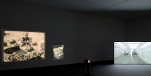
JB: A few weeks ago I spent six jet-lagged hours of the early morning in the Hong Kong airport. In my daze, this empty, brightly lit, newly cleaned shopping mall made me feel as though I had been cast within your 3D video Untitled (Animation) [2013, video HD, 5min 25sec, colour/sound, loop]. This work seems like a relic from the future as much as Views (This Formless Thing) seems one from the past.
This homogenisation does not only mean that everything starts looking the same, it also blurs functionalities — the result of an aesthetic if not ideological convergence of formerly separate sectors.
AN: When I started working with the animator, in order to build the 3D environment we needed a reference bank of images – something to start from – and so I went through a lot of images of retail and transitional spaces [airport corridors, shopping mall entrances], looking at what is considered innovative interior design today. As we were collecting these kinds of images, what struck me was that these streamlined spaces were similar in form to those that were considered futuristic in the 1960s – Disney’s famous Monsanto House of the Future, built in 1957, for instance. But of course what we consider state of the art today has grown from past ideas of the future: a promise of movement or speed. Same thing with hypermodern airports, they always have a retro feel.06I wanted to create a sense of the simultaneity of past and present, a strange coexistence. Another thing I noticed when looking at all these images is that despite the different functions of these spaces they seem to resemble each other more and more. They all make use of indirect light, flowing spaces, reflective or smooth surfaces, and lots of symbolic empty open space. These architectural or structural devices were not only employed by retail spaces, or airports, but also by the service sector: banks and government buildings, spaces that previously had their different function visually encoded, all started resembling each other. In Holland, there are bank branches that look like cocktail lounges. This homogenisation does not only mean that everything starts looking the same, it also blurs functionalities — the result of an aesthetic if not ideological convergence of formerly separate sectors. Such unobstructed free-flowing movement leads to an idea of who and what these spaces are designed for — weightless bodies, bodies that are conceived primarily as sites of exchange, bodies to receive commodities, and services that appear as if by magic. Whenever I am physically inside such a space, I get this strange melancholy. This architecture, so global and generic, should have some kind of shielding or appeasing function, but one’s familiarity with it can’t shield you from feeling lost.
JB: This is a silly anecdote, but I’m always struck by how many times, in airport lounges, it will be 7am, and there is someone having a glass of wine because it is probably 10pm in their time zone. There is a melancholy to that evident isolation; everyone is alone in time despite sharing this physical space.
AN: I wanted to use this very sensation of melancholy to create an artificial space that just focused on the reflections of the architecture, a total emphasis on surface.
JB: So this work is an expression of ‘melancholia’ articulated through a computerised perspective of an inhuman subject, but via architecture?
AN: Perhaps. I wanted to use a camera that felt subjective but at the same time was, as you say, impersonal or disembodied. So, although the camera is at the level of a person, I wanted the movement to be extremely smooth and flowing to convey a certain loss of gravity. When you watch the animation, there are certain scenes where a camera would have been reflected in the mirrors if these sequences were filmed in a real space. This idea was important from the beginning. I wanted to emphasise the absence of the camera in order to convey a strong feeling of disembodiment or flow.
JB: Like an immaterial approximation of a person, or a ghost. Using 3D animation you remove the possibility of human error or individual subjectivity from this work.
AN: Actually there is a function you can programme called ‘random’. It is possible to design a perfect curve for the camera, but then you can also add this random deviation, which you cannot control. And this randomness is supposed to make it look more human, through error, but of course it doesn’t really look human even so.
JB: This seems very cynical, like a commercial projection of what a consumer might do in order to design spaces that would maximise profit.
It was not possible to escape “outside” economic realities in order to produce this digital world.
AN: 3D animation is the main visualisation tool used by architects, and I am sure this has had a certain influence on actual architecture. There must be a reciprocal action or retroactive effect between the design process and the tools and parameters of visualisation. I think of digital 3D modelling and animation as the ultimate space for plasticity and malleability: flatness can be eliminated; material and surface properties can be assigned effortlessly to objects; and objects, bodies and light can be made to behave or interact in ways that either accord with or defy natural laws. Although it seems immaterial, it isn’t really. It is also worth noting that due to time and budget constraints we had to send the sequences to be rendered by a company based in the Canary Islands (it takes about twenty minutes to render each frame for animation). It was not possible to escape ‘outside’ economic realities in order to produce this digital world. Though this animation serves as a counterpoint to the found or archival material in the show, it circles around similar questions of plasticity, disembodiment, commodity fetishism, magic and materiality within a framework of global politics.
Navratil’s first solo museum exhibition is currently at the Kunstmuseum Winterthur, Switzerland until 8 December 2013, and will tour to Stedelijk Museum Bureau Amsterdam in early 2014.07

Footnotes
-
See Michael Taussig, What Color Is the Sacred?, Chicago: University of Chicago Press, 2009, pp.47–57. On page 48, Taussig evokes Benjamin’s description of a childlike perception of colour as when one ‘overcomes the illusory barrier of the book’s surface and and passes through colored textures and brightly colored partitions to enter a stage on which fairy tales spring to life.’ For further reference, see Walter Benjamin, ‘A Child’s View of Color’ [1914–15], in Marcus Bullock and Michael W. Jennings(ed.), Walter Benjamin: Selected Writings, Vol. 1: 1913–1926, Cambridge, MA: Harvard University Press, 1996, pp.50–51.
-
See Tom Gunning, ‘Before documentary: early nonfiction films and the “view aesthetic”’, in Daan Hertogs and Nico de Klerk (ed.), Uncharted Territory: Essays on Early Nonfiction Films, Amsterdam: Stichting Nederlands Filmmuseum, 1997, pp.9–25. In this essay, Gunning argues that the ‘view’ aesthetic characterises one of two types of pre-World War I non-fiction films. He writes: ‘I believe that “view” films made the fashioners of the documentary tradition [non-fiction films after World War I] uncomfortable, because they reveal the ambiguous power relations of the look so nakedly. The voyeurism implicit in the tourist, the colonialist, the filmmaker and the spectator is laid bare in these films, without the naturalization [sic] of dramatic structure or political argument’ (p.24).
-
For an elaboration of the hypermodern, see Paul Virilio, From Modernism to Hypermodernism and Beyond, London: Sage Publications, 2000.
-
Alexandra Navratil – This Formless Thing’, will be at Kunstmuseum Winterthur, Switzerland until 8 December 2013 before touring to the Stedelijk Museum Bureau Amsterdam (8 February–30 March 2014). Accompanying the exhibition is a catalogue published by Roma Publications in collaboration with Kunstmuseum Winterthur and SMBA Amsterdam. For more information see www.alexandranavratil.com